Negative Correlation Strategies


Correlation measures how two assets move in relation to each other.
A negative correlation means that as one asset’s value increases, the other tends to decrease.
This relationship is key for portfolio diversification and many types of trading strategies.
Investors and traders look for negatively correlated assets or returns stream to balance their portfolios and manage risk.
Not all negative correlations are equal; the strength can vary, which changes their mathematical value to a portfolio.
Key Takeaways – Negative Correlation Strategies
- Uncorrelated strategies help to improve return-to-risk ratios. Negative correlation strategies are even better.
- Diversification Power
- Negatively correlated assets can offset losses during market downturns.
- This can smooth overall returns and reducing portfolio volatility when other sources of return kick in when others do worse.
- Strategy Variety
- Options range from inverse ETFs and volatility products to managed futures and process-driven investments, each with unique risk-return profiles.
- Implementation Challenges
- These strategies often involve higher costs, complexity, and potential correlation breakdowns during extreme market stress.
Why Negative Correlation Matters
In turbulent markets negatively correlated assets can be a lifeline.
They act as a hedge, potentially offsetting losses in other parts of your portfolio.
This balancing act can better smooth out returns over time.
It’s not just about avoiding or reducing losses but about creating a stronger overall strategy or portfolio.
Negative correlation can help investors stay the course during market downturns, reducing the temptation to make emotional decisions.
The math shows that having a zero correlation between assets or returns streams helps to improve your risk/return ratio as follows:
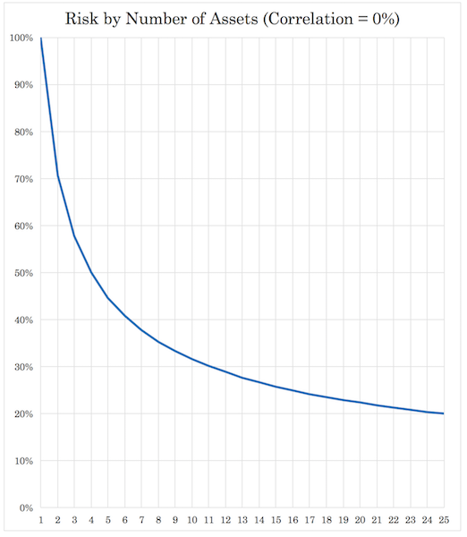
In other words, 4 uncorrelated returns streams (equal return/equal risk) cuts your risk in half; nine cuts its by two-thirds; 16 by 75%; 25 by 80%. Naturally, it’s very difficult to have 25 truly uncorrelated returns streams (or even 15) because of the cross-correlations, but it’s an important relationship to understand.
But negatively correlated return streams are even better if they offer the same return/risk characteristics.
Traditional Investments: Stocks and Bonds
Stocks are equity claims. They represent ownership in profit-generating/profit-seeking companies.
Bonds are debt claims. They’re senior in the capital structure of a company (i.e., bondholders get paid before stockholders).
Sometimes these two asset classes have exhibited a negative correlation, but they aren’t reliably diversifying.
When the environment favors stocks, they may be unfavorable for bonds, and vice versa.
They can diversify well with respect to growth but not necessarily inflation.
This relationship isn’t perfect or constant, but it’s been a cornerstone of portfolio construction for decades.
Understanding the dynamics between stocks and bonds is important for grasping the role of alternative negative correlation strategies because they need to be of a fundamentally different character than each.
Specific Negative Correlation Strategies
Inverse ETFs and Short Selling
Inverse ETFs look to deliver the opposite performance of a specific index or asset – using derivatives to achieve this goal.
Short selling involves borrowing shares and selling them, hoping to buy them back at a lower price.
Both strategies can provide strong negative correlation to traditional long positions.
They nonetheless come with unique risks, including potential unlimited losses in short selling and the effects of daily compounding in inverse ETFs (which is why they’re best for day traders and not those holding beyond one day).
Volatility-Based Strategies
The VIX index, often called the “fear gauge,” typically spikes when stock markets plummet.
Traders can use VIX futures or ETFs to gain exposure to volatility.
These instruments often show a strong negative correlation to stock market performance.
Note that volatility products can be complex and are generally more suitable for short-term trading rather than long-term investing.
Precious Metals: Gold and Silver
Gold, in particular, has long been considered a safe-haven asset.
During times of greater-than-normal economic uncertainty or market stress, gold prices often rise as traders seek stability.
It’s often considered an inverse currency asset, due to its pricing as a certain amount of currency per ounce (i.e., goes up when the value of the currency goes down).
This tendency can create a negative correlation with stocks.
Silver, while more volatile, less liquid, and correlated more with risk assets due to industrial use, can also exhibit similar properties.
The relationship isn’t always consistent, but it’s strong enough that many traders include precious metals in their portfolios as a diversification method.
Currency Strategies
Some currencies, like the Japanese Yen and Swiss Franc, are considered safe-haven currencies.
They often appreciate when global markets are in turmoil.
This creates a negative correlation with risky assets like stocks.
Currency pairs can be traded directly in the forex market or through ETFs.
It’s crucial to understand that currency movements are influenced by numerous factors, including interest rates, economic policies, and geopolitical events.
Long-Short Equity Strategies
These strategies involve taking long positions in stocks expected to outperform and short positions in those expected to underperform.
The goal is to generate returns regardless of overall market direction.
When executed well, long-short strategies can have a low or negative correlation with broad market indices.
They require skill in stock selection and risk management.
Many hedge funds use this approach, but it’s also available through some mutual funds and ETFs.
Managed Futures
Managed futures strategies, often implemented by Commodity Trading Advisors (CTAs), trade futures contracts across various asset classes.
They can go long or short based on trend-following or other quantitative models.
This flexibility allows them to potentially profit in both rising and falling markets.
Managed futures have shown the ability to perform well during stock market downturns, exhibiting negative correlation when it’s most needed.
DBMF and CTA are the most popular ETFs here.
Related: CTA Strategies
Spread Strategies
Spread strategies can achieve zero or negative correlation by exploiting price differentials between related assets or contracts.
For example, in a backwardated oil futures curve, shorting front-month oil (which often correlates positively with equities) while going long on longer-dated contracts can create a position that’s less sensitive to overall market movements.
Other examples include:
- Calendar spreads in options, where you sell near-term options and buy longer-dated ones.
- Yield curve trades in bonds, such as flatteners or steepeners.
- Pairs trading in stocks, shorting one company while going long its competitor.
- Commodity crack spreads, like going long crude oil and short gasoline.
These strategies often derive returns from relative price movements rather than absolute directional moves.
Accordingly, these can provide diversification benefits to a traditional long-only portfolio.
Tail Risk Hedging
Tail risk hedging strategies focus on protecting against extreme market events.
They often involve buying out-of-the-money put options on stock indices or using more complex option strategies.
These strategies can be kind of a “slow bleed” to maintain but can provide significant protection during market crashes.
The negative correlation is most pronounced during severe downturns, making them a form of “insurance” for portfolios.
Process-Driven Investments
Process-driven strategies can represent zero or negative correlation to traditional investments by deriving value from sources independent of market movements.
Building your own assets, such as developing a business or value-additive real estate, creates value through personal effort and management rather than market appreciation.
Value-additive processes – like refining raw materials, turning raw materials into finished products, improving operational efficiency – generate returns based on specific actions rather than broader economic trends.
Activism could also fall within this category.
Even holding a regular job provides a steady income stream largely unaffected by stock market fluctuations.
Often a job is the best investment you have. Even better if you can turn it into something with a passive element (e.g., a musician who creates a piece of music once and sells it for years).
These strategies often have minimal correlation with financial markets because their success depends on factors like individual skill, local economic conditions, or industry-specific dynamics.
During market downturns, these process-driven approaches may maintain or even increase in value, as they rely on tangible outputs or services that remain in demand regardless of market sentiment.
This independence from market forces can give you a stabilizing effect on an overall investment portfolio, potentially offsetting losses in more traditional market-linked assets.
Also note that a lack of liquidity and not being able to see the price doesn’t mean something is safer.
Reinsurance & Catastrophe Bonds
Reinsurance and catastrophe bonds can serve as negative correlation strategies due to their unique risk profiles.
Reinsurance involves insurance companies transferring portions of their risk portfolios to other parties.
Catastrophe bonds are financial instruments that transfer specific risks (like natural disasters) from issuers to investors.
These strategies typically have low correlation with traditional markets because their performance is tied to the occurrence of specific events rather than economic conditions and market cycles.
When catastrophic events occur, these investments may pay out while traditional markets decline. So it can potentially provide a hedge against market downturns.
However, they carry their own distinct risks, including the potential for large losses if major catastrophes occur due to the insurance payouts owed.
In stock form – e.g., Swiss RE – they tend to have positive correlation to standard indices. Ultimately, interest rates and liquidity tie many investments together.
Additional Negative Correlation Strategies Not Considered Above
The strategies above cover the main categories, but there are other ways investors and traders try to build negative or crisis-sensitive correlation into a portfolio.
Some are true hedges.
Some are closer to diversifiers.
Others are better understood as portfolio construction techniques that create negative correlation only in certain regimes.
That’s important because negative correlation isn’t a permanent property. It’s a behavior that shows up under specific conditions/environments/circumstances.
A strategy can have a low average correlation and still fail/tightly correlate with most other things when liquidity tightens.
Conversely, it can also have a positive long-run correlation and still provide useful protection in the exact environment where the rest of the portfolio is most vulnerable.
So the better question is not only, “What has a negative correlation?”
It’s also, “Negative to what, over what time horizon, under what economic shock, and at what cost?”
There are negative correlation strategies, but if you’re paying 4% carry a year to hold them, just for them to maybe work out well once a decade (e.g., shorting credit spreads, long put options), it can still have negative value in a portfolio.
It can still have value, but the funding cost is a factor that has to be worked out (e.g., converting to spreads, buying more OTM, considering synergies with the broader portfolio).
Credit Protection and Short Credit Exposure
Credit hedging is a more institutional-style strategy.
Stocks often fall when credit spreads widen because both are claims on future economic cash flows.
When growth deteriorates, default risk rises, financing becomes more expensive, and traders demand more compensation to hold risky debt.
That is why credit protection can behave as a negative correlation strategy during recessions and liquidity shocks.
The basic version is shorting high-yield bonds or loans, though this can be expensive and difficult to size.
The institutional version is buying protection on credit default swap indexes.
If credit spreads widen, the value of that protection can rise even while equities are falling.
A simpler public-market proxy is to use inverse or short exposure to high-yield bond ETFs, though these come with tracking, borrowing, and compounding issues.
Credit hedges also are not perfect equity hedges.
They respond most directly to spread widening, not every type of stock market decline.
A valuation-driven equity correction, where earnings remain fine and credit stays calm, may not help much.
But in a true risk-off recessionary environment, credit protection can be one of the more direct ways to hedge the part of equity risk tied to corporate balance sheets and refinancing conditions.
The trade-off is carry cost.
Like insurance, credit protection can lose money slowly during calm markets.
And its beta is lower than equities, so even in a risk-off event it may not be sufficiently protective.
Rate Options and Recession Convexity
Bonds were discussed above, but options on interest rates are a different type of thing.
A long Treasury position can help when growth weakens and rates fall, but the payoff is still linear.
Rate options can create convex exposure to a specific macro outcome.
For example, receiver swaptions, Treasury call options, or options on Treasury futures can gain value if yields fall sharply.
This can be useful because equity bear markets caused by growth weakness often come with falling rates, especially when central banks cut policy rates or investors rush into safe assets.
The advantage is that rate options can provide large payoff potential without tying up as much capital as a full bond position.
The disadvantage is that they expire.
They also depend on the type of shock.
If stocks fall because inflation is rising and rates are also rising, a recession-style rate hedge can fail at exactly the wrong time.
This is why rate-option hedging needs to be matched to the risk being hedged.
- Receiver-style structures are more useful against deflationary recession shocks.
- Payer-style structures, which benefit from rising rates, are more useful against inflation shocks, but they may not offset equity losses unless the equity decline is itself caused by the rate increase.
The hedge is therefore highly regime-/environment-dependent.
Equity Index Collars and Put-Spread Collars
There’s a more practical family of hedges that sits between buying disaster insurance and simply holding a diversified portfolio.
These are equity index collars and put-spread collars.
Collar
A basic collar buys a put option below the market and sells a call option above the market.
In terms of a payoff diagram:
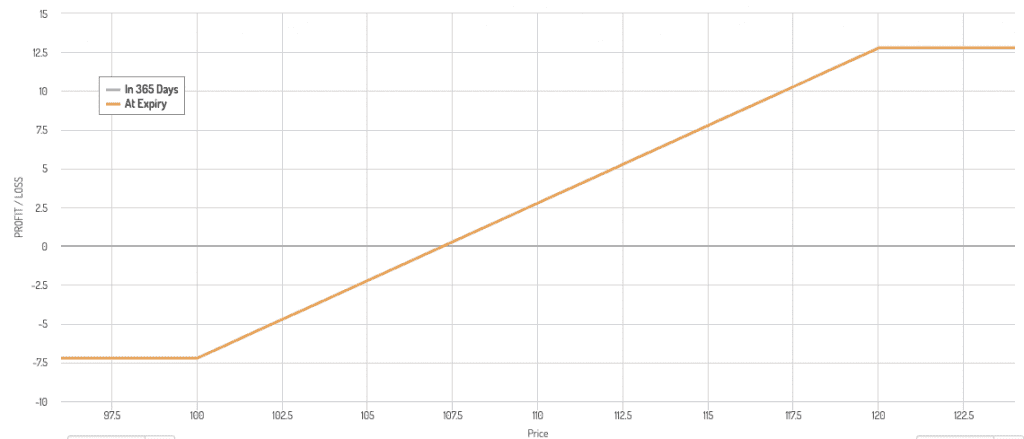
The put provides downside protection.
The call helps pay for the put but gives up some upside if the market rallies strongly. This can be a worthwhile trade-off for many traders.
Put-Spread Collar
A put-spread collar modifies this by buying one put and selling a lower-strike put, while also selling a call.
This protects against ordinary bear markets but not unlimited downside.
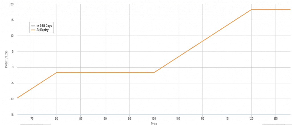
For many portfolios, that trade-off is acceptable. The goal is to reduce the worst drawdowns enough so that it can keep compounding.
These strategies can create negative correlation over a defined range of market losses.
As the index falls toward the long put strike, the hedge rises in value.
But once losses move beyond the short put in a put spread, the protection stops.
- The main advantage is cost control. Moreover, outcomes are kind of what you want in the fat part of the distribution (modest gains and minimal losses).
- The main disadvantage is path dependency and suboptimal outcomes in the tails (capped upside and linear downside).
Option strikes, expirations, implied volatility, and roll timing can matter as much as the broad idea of the hedge.
Volatility Targeting and De-Risking Rules
Not every negative correlation strategy has to be a separate asset.
Some are rules for changing exposure.
Volatility targeting is one example.
In a volatility-targeted portfolio, exposure is reduced when realized volatility rises and increased when volatility falls.
Because equity volatility often rises during sell-offs, the rule tends to reduce equity exposure during stressful periods.
This can create a negative relationship between market stress and portfolio risk.
The portfolio isn’t making money because stocks are falling, but it is reducing the amount of capital exposed to the decline.
That can still have a large effect on drawdowns and compounding.
The weakness is that volatility targeting can whipsaw.
If the market falls, volatility rises, the strategy cuts risk, and then the market immediately rebounds, the portfolio may miss part of the recovery.
It can also be too slow during a crash that happens faster than the measurement window can respond.
It can also cause traders to do the opposite of what’s logical – i.e., levering higher when assets run higher (more expensive) and delevering when assets fall and become cheaper.
Nonetheless, rules-based de-risking can be a useful complement to static hedges.
It is especially helpful for traders who know they are unlikely to make calm discretionary decisions in a crisis.
The rule becomes a pre-commitment device.
Quality, Low-Volatility, and Anti-Beta Equity Baskets
Defensive equity factors aren’t usually negatively correlated with the stock market.
They’re still stocks.
But they can be negatively correlated to high-beta or speculative equity exposure.
That makes them useful inside an equity portfolio where the goal isn’t to eliminate stock risk entirely, but to reduce exposure to the weakest parts of the equity risk spectrum.
Quality companies, low-volatility stocks, stable dividend growers, and businesses with durable margins often fall less in risk-off environments.
Research has shown that quality and value factors are return-additive and provide more return per each unit of risk.
A long-only defensive factor tilt may simply reduce beta.
A long-short version can go further by owning lower-beta or higher-quality companies while shorting high-beta, low-quality, or unprofitable companies.
That structure can become negatively correlated to broad risk appetite.
When speculative stocks lead the market, it may lag or lose.
When speculation unwinds, it may protect capital or even make money.
The limitation is that defensive equity can become crowded.
If investors overpay for stability, the valuation risk can offset the fundamental quality.
And in sharp liquidity events, even high-quality stocks can be sold because they are liquid and profitable to sell.
This is a diversifier, no guarantee.
Merger Arbitrage and Event-Driven Spreads
Merger arbitrage is another strategy that can have low correlation to broad equity markets.
There is still some correlation because deals are more likely to close in favorable environments.
| Name | Ticker | SPY | ARB | MNA | Annualized Return | Daily Standard Deviation | Monthly Standard Deviation | Annualized Standard Deviation |
|---|---|---|---|---|---|---|---|---|
| State Street SPDR S&P 500 ETF | SPY | 1.00 | 0.29 | 0.17 | 18.05% | 1.07% | 4.53% | 15.70% |
| AltShares Merger Arbitrage ETF | ARB | 0.29 | 1.00 | 0.47 | 4.59% | 0.27% | 0.90% | 3.12% |
| NYLI Merger Arbitrage ETF | MNA | 0.17 | 0.47 | 1.00 | 3.14% | 0.33% | 1.11% | 3.83% |
| Asset correlations for time period 06/01/2020 – 05/31/2026 based on monthly returns | ||||||||
We can see the correlation pick up a bit if we just track SPY’s correlation to MNA as ARB doesn’t have a long history:
Asset Correlations
| Name | Ticker | SPY | MNA | Annualized Return | Daily Standard Deviation | Monthly Standard Deviation | Annualized Standard Deviation |
|---|---|---|---|---|---|---|---|
| State Street SPDR S&P 500 ETF | SPY | 1.00 | 0.42 | 14.44% | 1.08% | 4.16% | 14.43% |
| NYLI Merger Arbitrage ETF | MNA | 0.42 | 1.00 | 2.69% | 0.47% | 1.39% | 4.82% |
| Asset correlations for time period 12/01/2009 – 05/31/2026 based on monthly returns | |||||||
The basic trade is to buy the target company after a deal is announced and earn the spread between the market price and the acquisition price if the deal closes.
In stock-for-stock deals, the arbitrageur may short the acquirer to isolate the deal spread.
The return driver isn’t supposed to be the stock market.
It is supposed to be deal completion, regulatory approval, financing, timing, and the probability of closing.
That can make the strategy reasonably diversifying in normal environments.
But it’s not always negatively correlated in crises.
In market stress, deals can break, financing can become more expensive, regulators can become less predictable, and spreads can widen abruptly.
So merger arbitrage is often better classified as an alternative risk premium than a true hedge.
It may improve portfolio efficiency over time, but it shouldn’t be relied on as crash protection unless the exposure is explicitly hedged and sized with deal-break risk in mind.
The key is understanding that “market neutral” and “crisis neutral” aren’t the same thing.
Convertible Arbitrage
Convertible arbitrage is another relative-value strategy that can behave differently from plain equities.
A convertible bond has characteristics of both debt and equity.
It pays interest like a bond, but it also contains an option to convert into stock.
A convertible arbitrage strategy often buys the convertible security and shorts some amount of the underlying stock.
The goal is to isolate mispricing among credit, volatility, interest rates, and the embedded equity option.
In theory, this can create a return stream that is less dependent on the market direction.
It may benefit when realized volatility is higher than implied or when the bond’s optionality is underpriced.
But the risks are numerous.
Convertibles are exposed to liquidity, credit spreads, borrow costs, model assumptions, and the behavior of the underlying stock.
During a liquidity crisis, convertible arbitrage can lose money even if the individual trades looked hedged.
Forced selling can overwhelm theoretical value.
For that reason, convertible arbitrage is better viewed as a skilled relative-value strategy than a simple negative correlation allocation.
It can diversify, but it can also become correlated to credit and liquidity stress.
Commodity and Inflation-Shock Baskets Beyond Gold
Gold is the most familiar crisis hedge, but it’s not the only asset that can help in inflationary or supply-shock environments.
Broad commodity exposure, energy futures, agricultural commodities, and industrial metals can all behave differently from financial assets.
They are claims on real inputs rather than corporate earnings.
This matters because some of the worst environments for traditional portfolios occur when inflation rises, rates rise, and stock and bond correlations become positive.
In those periods, commodities can provide a different return driver.
The protection isn’t the same as recession protection.
Commodities can fall sharply when growth collapses.
They can also be volatile, difficult to hold, and sensitive to futures curve structure.
A commodity position with a negative roll yield can lose money even if spot prices don’t move much.
The best role for commodities is often as a targeted inflation or supply-shock hedge, not as a universal negative correlation asset.
They hedge the environment where money is losing purchasing power and financial duration is being repriced.
That is different from hedging a standard growth slowdown.
Cash, T-Bills, and Dry Powder Rebalancing
Cash isn’t a negative correlation asset in the strict sense.
It is closer to a zero-correlation asset.
But it can still function like a negative correlation tool when paired with disciplined rebalancing.
When risky assets fall, cash gives the investor the ability to buy assets after prices decline.
The negative correlation comes from the rebalancing process rather than the cash itself.
Cash also reduces forced-selling risk.
A portfolio with no liquidity may have to sell risky assets during a drawdown to meet expenses, margin calls, redemptions, or obligations.
A portfolio with adequate cash can avoid selling into weakness.
This is especially important for leveraged investors, retirees, businesses, and institutions with spending needs.
The opportunity cost is obvious.
Cash usually has lower long-term expected returns than risk assets.
Holding too much cash can drag performance.
But in portfolio construction, the value of cash is not only its yield.
It’s also optionality, stability, and the ability to act when others are constrained.
Correlation and Dispersion Trades
Another institutional category is correlation trading.
This includes strategies built around the relationship between index volatility, single-stock volatility, and the correlations among the components of an index.
In ordinary markets, stocks may move based on company-specific information.
In crises, correlations often rise because macro risk dominates everything.
A strategy that benefits from rising index correlation can act as a hedge against market stress.
For example, long index volatility relative to single-name volatility can benefit when the market begins moving as one unit.
The issue is that these trades are complex, path-dependent, and sensitive to volatility pricing.
They aren’t usually appropriate for casual traders.
They also require careful management because the pricing of correlation risk can change quickly.
Still, the idea matters because it shows that negative correlation can be created at the level of relationships, not just by choosing a different asset.
Sometimes the hedge is not “own asset B because asset A falls.”
Sometimes it’s “own the spread between how assets usually move together and how they move together in a crisis.”
Royalty, Litigation, and Contractual Cash Flow Strategies
Some private or semi-private strategies seek diversification through cash flows tied to contracts rather than public-market pricing.
Examples include music royalties, pharmaceutical royalties, litigation finance, structured settlements, and other contractual claims.
These aren’t automatically negative correlation strategies.
But they may have low sensitivity to public equities if the cash flows depend on usage, legal outcomes, licensing agreements, or defined payment streams rather than broad market multiples.
The danger is that illiquidity can hide risk.
A private asset that doesn’t mark down every day may look stable even if its economic value has changed.
The trader may also face underwriting risk, legal risk, platform risk, duration risk, and limited exit options.
Some of them are pure cash flows and not the capitalized value you see headlining your portfolio and investment at the individual line item.
These strategies can diversify a portfolio, but they shouldn’t be confused with liquid hedges.
They won’t necessarily provide cash at the exact moment a public portfolio is falling.
Their role is usually long-horizon diversification, not immediate crisis protection.
The Main Lesson
The common thread is that negative correlation has to be engineered around a specific risk.
- Credit protection hedges spread widening.
- Rate options hedge interest-rate shocks.
- Commodity baskets hedge inflation and supply shocks.
- Collars hedge defined equity drawdowns.
- Volatility targeting reduces exposure when market stress rises.
- Defensive equity spreads hedge speculative risk appetite.
- Relative-value strategies try to isolate non-market return drivers.
None of these is a universal solution.
Each one works best when the loss in the main portfolio comes from the exact risk the hedge was designed to offset.
That’s why a strong portfolio usually combines several forms of diversification rather than relying on one solution.
The goal is to own a set of return streams that respond differently to growth shocks, inflation shocks, liquidity shocks, credit shocks, and even behavioral shocks.
That is how negative correlation becomes useful in practice.
Are There Negatively Correlated Stocks to Main Indices?
Can we get negatively correlated strategies by simply looking within the stock market itself?
Negatively correlated stocks usually come in the form of gold miners.
Gold traditionally, but not always, has no correlation to the broader market. (It can sometimes be positive or negative).
Some examples vs. SPY:
Asset Correlations
| Name | Ticker | SPY | NEM | FNV | RGLD | AEM | WPM | Annualized Return | Daily Standard Deviation | Monthly Standard Deviation | Annualized Standard Deviation |
|---|---|---|---|---|---|---|---|---|---|---|---|
| State Street SPDR S&P 500 ETF | SPY | 1.00 | 0.14 | 0.19 | 0.17 | 0.15 | 0.28 | 11.36% | 1.25% | 4.55% | 15.75% |
| Newmont Corp | NEM | 0.14 | 1.00 | 0.65 | 0.72 | 0.78 | 0.70 | 6.64% | 2.50% | 10.75% | 37.23% |
| Franco-Nevada Corporation | FNV | 0.19 | 0.65 | 1.00 | 0.70 | 0.71 | 0.75 | 17.28% | 2.36% | 9.85% | 34.12% |
| Royal Gold, Inc. | RGLD | 0.17 | 0.72 | 0.70 | 1.00 | 0.72 | 0.71 | 12.71% | 2.44% | 11.88% | 41.15% |
| Agnico Eagle Mines Ltd | AEM | 0.15 | 0.78 | 0.71 | 0.72 | 1.00 | 0.74 | 8.37% | 2.88% | 13.09% | 45.34% |
| Wheaton Precious Metals Corp | WPM | 0.28 | 0.70 | 0.75 | 0.71 | 0.74 | 1.00 | 12.99% | 2.95% | 14.21% | 49.24% |
| Asset correlations for time period 01/01/2008 – 05/31/2026 based on monthly returns | |||||||||||
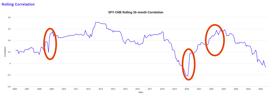
Another potential example is CME and CBOE, because trading volatility (i.e., what’s bad for stocks) is generally good for their revenue. But they still tend to have slightly positive correlation.
Asset Correlations
| Name | Ticker | SPY | CME | CBOE | Annualized Return | Daily Standard Deviation | Monthly Standard Deviation | Annualized Standard Deviation |
|---|---|---|---|---|---|---|---|---|
| State Street SPDR S&P 500 ETF | SPY | 1.00 | 0.35 | 0.30 | 15.36% | 1.07% | 4.13% | 14.30% |
| CME Group Inc | CME | 0.35 | 1.00 | 0.50 | 15.02% | 1.51% | 5.63% | 19.49% |
| Cboe Global Markets Inc. | CBOE | 0.30 | 0.50 | 1.00 | 17.67% | 1.55% | 6.75% | 23.37% |
| Asset correlations for time period 07/01/2010 – 05/31/2026 based on monthly returns | ||||||||
And, of course, we don’t necessarily care about average correlation, but about correlation in crises when we need it most.
Did these provide offsets during such periods – i.e., 2008, 2020, 2022 sell-off?
Short answer: no, the correlation grew stronger.
Examples of How These Strategies Work
Let’s say we have three strategies:
We can see the diversification value once we start adding them together while also allocating them appropriately.
Portfolio 1
| Asset Class | Allocation |
|---|---|
| US Stock Market | 100.00% |
Portfolio 2
| Asset Class | Allocation |
|---|---|
| US Stock Market | 40.00% |
| 10-year Treasury | 60.00% |
Portfolio 3
| Asset Class | Allocation |
|---|---|
| US Stock Market | 40.00% |
| 10-year Treasury | 45.00% |
| Gold | 15.00% |
Let’s see how they compare:
Performance Summary
| Metric | Portfolio 1 | Portfolio 2 | Portfolio 3 |
|---|---|---|---|
| Start Balance | $10,000 | $10,000 | $10,000 |
| End Balance | $2,614,786 | $854,125 | $1,240,912 |
| Annualized Return (CAGR) | 10.88% | 8.60% | 9.35% |
| Standard Deviation | 15.63% | 8.16% | 8.22% |
| Best Year | 37.82% | 31.94% | 29.50% |
| Worst Year | -37.04% | -16.96% | -14.79% |
| Maximum Drawdown | -50.89% | -19.39% | -18.46% |
| Sharpe Ratio | 0.46 | 0.51 | 0.59 |
| Sortino Ratio | 0.66 | 0.78 | 0.91 |
The three portfolios illustrate how diversification affects not only the level of returns but also the quality of returns.
Portfolio 1, a 100% US equity allocation, delivers the highest terminal value and the highest CAGR, but it does so by accepting very high volatility and deep drawdowns.
A maximum drawdown of roughly 51% and a worst year near minus-37% place large behavioral and institutional constraints on holding the portfolio through full cycles.
The Sharpe and Sortino ratios are the weakest of the three. This means that returns aren’t efficient relative to the risk taken.
Portfolio 2 introduces bond duration through a large allocation to 10-year Treasuries. Since bonds respond to different economic factors, the result is a dramatic reduction in volatility, drawdown, and downside risk.
Standard deviation is cut nearly in half, and maximum drawdown improves from roughly minus 51% to about minus 19%.
Although the CAGR declines, both the Sharpe and Sortino ratios improve meaningfully. This portfolio sacrifices some upside in exchange for much more stable compounding and a far narrower range of outcomes.
Portfolio 3 adds gold as a third, structurally different return driver. Volatility remains low, drawdowns are slightly improved versus Portfolio 2, and risk-adjusted returns improve further.
The Sharpe and Sortino ratios are the highest of the three. This reflects the better compensation per unit of total and downside risk. Importantly, this improvement is achieved without increasing volatility relative to the bond-heavy portfolio.
This comparison show the core value of diversification. Combining assets with different economic drivers, an investor can target the same volatility as an undiversified equity portfolio while achieving higher risk-adjusted returns and materially smaller drawdowns.
In practice, institutions would typically lever the diversified portfolio to match equity level volatility, producing a superior return profile with far better capital efficiency and drawdown control.
Risk and Return Metrics
| Metric | Portfolio 1 | Portfolio 2 | Portfolio 3 |
|---|---|---|---|
| Arithmetic Mean (monthly) | 0.97% | 0.72% | 0.78% |
| Arithmetic Mean (annualized) | 12.24% | 8.96% | 9.72% |
| Geometric Mean (monthly) | 0.86% | 0.69% | 0.75% |
| Geometric Mean (annualized) | 10.88% | 8.60% | 9.35% |
| Standard Deviation (monthly) | 4.51% | 2.36% | 2.37% |
| Standard Deviation (annualized) | 15.63% | 8.16% | 8.22% |
| Downside Deviation (monthly) | 2.92% | 1.33% | 1.33% |
| Maximum Drawdown | -50.89% | -19.39% | -18.46% |
| Benchmark Correlation | 1.00 | 0.80 | 0.79 |
| Beta(*) | 1.00 | 0.42 | 0.42 |
| Alpha (annualized) | 0.00% | 3.75% | 4.49% |
| R2 | 100.00% | 64.34% | 62.50% |
| Sharpe Ratio | 0.46 | 0.51 | 0.59 |
| Sortino Ratio | 0.66 | 0.78 | 0.91 |
| Treynor Ratio (%) | 7.14 | 9.90 | 11.66 |
| Calmar Ratio | 2.16 | 1.38 | 2.35 |
| Modigliani–Modigliani Measure | 11.60% | 12.42% | 13.69% |
| Active Return | 0.00% | -2.28% | -1.52% |
| Tracking Error | 0.00% | 10.31% | 10.43% |
| Information Ratio | N/A | -0.22 | -0.15 |
| Skewness | -0.52 | -0.04 | -0.14 |
| Excess Kurtosis | 1.90 | 1.15 | 1.30 |
| Historical Value-at-Risk (5%) | 7.05% | 3.25% | 3.18% |
| Analytical Value-at-Risk (5%) | 6.45% | 3.16% | 3.13% |
| Conditional Value-at-Risk (5%) | 9.93% | 4.56% | 4.36% |
| Upside Capture Ratio (%) | 100.00 | 48.20 | 49.71 |
| Downside Capture Ratio (%) | 100.00 | 35.22 | 33.33 |
| Safe Withdrawal Rate | 4.29% | 3.90% | 5.03% |
| Perpetual Withdrawal Rate | 6.41% | 4.40% | 5.08% |
| Positive Periods | 406 out of 647 (62.75%) | 425 out of 647 (65.69%) | 418 out of 647 (64.61%) |
| Gain/Loss Ratio | 1.03 | 1.17 | 1.27 |
| * US Stock Market is used as the benchmark for calculations. Value-at-risk metrics are monthly values. | |||
This expanded metric set makes clear that diversification improves not just volatility and drawdowns, but the entire distribution of returns.
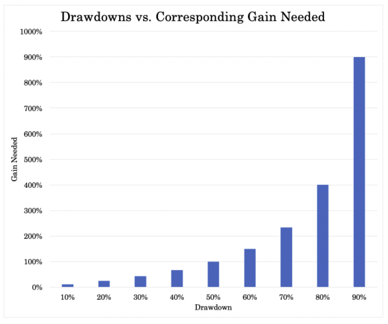
The gap between arithmetic and geometric returns is widest for Portfolio 1, reflecting heavy volatility drag. Even though its average returns look strong on paper, compounding efficiency suffers because large losses require disproportionately large gains to recover, as illustrated below.
Portfolios 2 and 3 narrow this gap materially, meaning more of the gross return actually survives compounding over time.
Risk asymmetry improves meaningfully as diversification increases. Downside deviation, Value at Risk, and Conditional Value at Risk are all cut by more than half in Portfolios 2 and 3 relative to the equity-only portfolio.
This is critical for capital preservation because it limits left-tail outcomes rather than merely smoothing average volatility. Skewness also improves, which means fewer extreme negative return clusters.
The beta and R² statistics show how much hidden equity exposure dominates Portfolio 1. It’s fully explained by the stock market, leaving no independent return drivers.
By contrast, Portfolios 2 and 3 cut beta by more than half and materially reduce R². This means a large portion of returns come from sources unrelated to equity movements. That’s the goal.
Capture ratios further highlight this shift. While upside participation falls by design, downside capture drops much more sharply. Portfolio 3 participates in roughly half of market gains but only one third of market losses.
That asymmetry in turn explains its superior Sortino, Treynor, and gain loss ratios.
Finally, withdrawal metrics give a sense of real world implication. Portfolio 3 supports the highest safe and perpetual withdrawal rates despite lower nominal returns, because smaller drawdowns and reduced tail risk prevent permanent capital impairment.
For long horizon investors, this is often more important than maximizing terminal wealth.
Overall, the data shows that diversification reshapes return quality. It converts raw market exposure into a more durable, capital-efficient return stream that institutions can scale, lever, or use consistently across market outcomes.
Historical Market Stress Periods
| Stress Period | Start | End | Portfolio 1 | Portfolio 2 | Portfolio 3 |
|---|---|---|---|---|---|
| Oil Crisis | Oct 1973 | Mar 1974 | -12.61% | -5.98% | -3.22% |
| Black Monday Period | Sep 1987 | Nov 1987 | -29.34% | -13.23% | -11.79% |
| Asian Crisis | Jul 1997 | Jan 1998 | -3.72% | -2.67% | -2.51% |
| Russian Debt Default | Jul 1998 | Oct 1998 | -17.57% | -5.13% | -6.82% |
| Dotcom Crash | Mar 2000 | Oct 2002 | -44.11% | -5.55% | -7.12% |
| Subprime Crisis | Nov 2007 | Mar 2009 | -50.89% | -13.39% | -14.60% |
| COVID-19 Start | Jan 2020 | Mar 2020 | -20.89% | -4.02% | -5.18% |
These historical stress periods show how diversification changes outcomes when markets move in certain ways. It goes from theory to reality.
Across every major crisis, Portfolio 1 experiences deep and often compounding drawdowns.
Equity concentration exposes the portfolio to regime shifts where correlations converge and selling pressure becomes indiscriminate.
Losses during events such as the Dotcom crash and the 2008 GFC are large enough to permanently impair compounding. It requires many years of recovery just to break even.
Portfolio 2 demonstrates the stabilizing role of government bonds – i.e., most notably as a growth offset.
During equity-led crashes driven by a fall in growth, Treasuries help absorb risk and can materially reduce drawdowns across nearly every stress window.
The improvement is especially visible in longer, more grinding downturns such as 2000-2002 and 2007-2009, where losses are reduced by more than two-thirds.
This shows that diversification isn’t only about basic volatility considerationsbut also about surviving extended periods of negative returns.
Portfolio 3 further improves with gold adding another type of return-additive unique exposure, which responds to different stress mechanisms than either stocks or bonds.
In inflationary or confidence-driven crises such as the Oil Crisis, gold provides an additional buffer.
Portfolio 3 doesn’t always outperform Portfolio 2 in every event, its drawdowns are consistently contained within a narrow range, which reduces path dependency and the risk of large losses.
The most important observation is consistency. Portfolio 1 swings widely across stress events, while Portfolios 2 and 3 cluster more tightly around manageable losses.
That predictability matters for institutions, endowments, and individuals because it allows capital to remain invested rather than being forced out at the worst possible time.
In practice, these results reinforce the core principle of uncorrelated allocations. Diversification certainly doesn’t eliminate losses, but it transforms market crises from what could be existential threats into tolerable drawdowns that preserve long-term compounding.
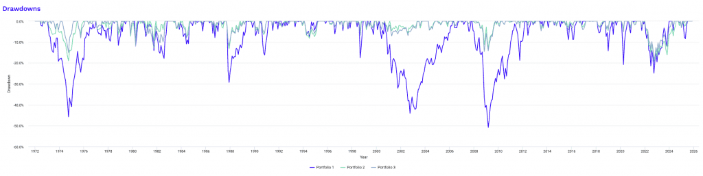
Some drawdowns for each portfolio are below.
We won’t go through these individually, but you can see how drawdowns compress and change based on each portfolio:
Drawdowns for Portfolio 1
| Rank | Start | End | Length | Recovery By | Recovery Time | Underwater Period | Drawdown |
|---|---|---|---|---|---|---|---|
| 1 | Nov 2007 | Feb 2009 | 1 year 4 months | Mar 2012 | 3 years 1 month | 4 years 5 months | -50.89% |
| 2 | Jan 1973 | Sep 1974 | 1 year 9 months | Dec 1976 | 2 years 3 months | 4 years | -45.86% |
| 3 | Sep 2000 | Sep 2002 | 2 years 1 month | Apr 2006 | 3 years 7 months | 5 years 8 months | -44.11% |
| 4 | Sep 1987 | Nov 1987 | 3 months | May 1989 | 1 year 6 months | 1 year 9 months | -29.34% |
| 5 | Jan 2022 | Sep 2022 | 9 months | Dec 2023 | 1 year 3 months | 2 years | -24.94% |
| 6 | Jan 2020 | Mar 2020 | 3 months | Jul 2020 | 4 months | 7 months | -20.89% |
| 7 | Dec 1980 | Jul 1982 | 1 year 8 months | Oct 1982 | 3 months | 1 year 11 months | -17.85% |
| 8 | Jul 1998 | Aug 1998 | 2 months | Nov 1998 | 3 months | 5 months | -17.57% |
| 9 | Jun 1990 | Oct 1990 | 5 months | Feb 1991 | 4 months | 9 months | -16.20% |
| 10 | Oct 2018 | Dec 2018 | 3 months | Apr 2019 | 4 months | 7 months | -14.28% |
| Worst 10 drawdowns included above | |||||||
Drawdowns for Portfolio 2
| Rank | Start | End | Length | Recovery By | Recovery Time | Underwater Period | Drawdown |
|---|---|---|---|---|---|---|---|
| 1 | Jan 2022 | Sep 2022 | 9 months | Jul 2024 | 1 year 10 months | 2 years 7 months | -19.39% |
| 2 | Jan 1973 | Sep 1974 | 1 year 9 months | Jun 1975 | 9 months | 2 years 6 months | -19.05% |
| 3 | Dec 2007 | Feb 2009 | 1 year 3 months | Sep 2009 | 7 months | 1 year 10 months | -13.39% |
| 4 | Sep 1987 | Nov 1987 | 3 months | Oct 1988 | 11 months | 1 year 2 months | -13.23% |
| 5 | Sep 1979 | Mar 1980 | 7 months | May 1980 | 2 months | 9 months | -9.74% |
| 6 | Jun 1981 | Sep 1981 | 4 months | Nov 1981 | 2 months | 6 months | -9.34% |
| 7 | Feb 1994 | Jun 1994 | 5 months | Mar 1995 | 9 months | 1 year 2 months | -8.24% |
| 8 | Jul 1983 | May 1984 | 11 months | Aug 1984 | 3 months | 1 year 2 months | -7.92% |
| 9 | Jul 1975 | Sep 1975 | 3 months | Dec 1975 | 3 months | 6 months | -6.51% |
| 10 | Aug 1990 | Sep 1990 | 2 months | Dec 1990 | 3 months | 5 months | -6.42% |
| Worst 10 drawdowns included above | |||||||
Drawdowns for Portfolio 3
| Rank | Start | End | Length | Recovery By | Recovery Time | Underwater Period | Drawdown |
|---|---|---|---|---|---|---|---|
| 1 | Jan 2022 | Sep 2022 | 9 months | Mar 2024 | 1 year 6 months | 2 years 3 months | -18.46% |
| 2 | Mar 1974 | Sep 1974 | 7 months | Feb 1975 | 5 months | 1 year | -15.08% |
| 3 | Mar 2008 | Oct 2008 | 8 months | Sep 2009 | 11 months | 1 year 7 months | -14.60% |
| 4 | Dec 1980 | Sep 1981 | 10 months | Aug 1982 | 11 months | 1 year 9 months | -13.08% |
| 5 | Feb 1980 | Mar 1980 | 2 months | Jun 1980 | 3 months | 5 months | -11.92% |
| 6 | Sep 1987 | Nov 1987 | 3 months | Jan 1989 | 1 year 2 months | 1 year 5 months | -11.79% |
| 7 | Jul 1975 | Sep 1975 | 3 months | Jan 1976 | 4 months | 7 months | -8.14% |
| 8 | Jul 1983 | May 1984 | 11 months | Oct 1984 | 5 months | 1 year 4 months | -7.95% |
| 9 | Sep 2000 | Mar 2001 | 7 months | May 2003 | 2 years 2 months | 2 years 9 months | -7.12% |
| 10 | Jul 1998 | Aug 1998 | 2 months | Oct 1998 | 2 months | 4 months | -6.82% |
| Worst 10 drawdowns included above | |||||||
Each asset class and its summary statistics:
Portfolio Assets
| Name | CAGR | Stdev | Best Year | Worst Year | Max Drawdown | Sharpe Ratio | Sortino Ratio |
|---|---|---|---|---|---|---|---|
| US Stock Market | 10.88% | 15.63% | 37.82% | -37.04% | -50.89% | 0.46 | 0.66 |
| 10-year Treasury | 6.30% | 8.02% | 39.57% | -15.19% | -23.18% | 0.25 | 0.38 |
| Gold | 8.67% | 19.59% | 126.55% | -32.60% | -61.78% | 0.29 | 0.49 |
Portfolio Asset Performance
| Name | Total Return | Annualized Return | ||||
|---|---|---|---|---|---|---|
| 3 Month | Year To Date | 1 year | 3 year | 5 year | 10 year | |
| US Stock Market | 6.00% | 17.06% | 13.50% | 19.68% | 13.95% | 13.89% |
| 10-year Treasury | 2.37% | 8.86% | 6.05% | 3.25% | -1.78% | 1.26% |
| Gold | 21.95% | 60.19% | 57.94% | 33.02% | 18.40% | 14.30% |
| Trailing returns as of last calendar month ending November 2025 | ||||||
Correlations:
Monthly Correlations
| Name | US Stock Market | 10-year Treasury | Gold | Portfolio 1 | Portfolio 2 | Portfolio 3 |
|---|---|---|---|---|---|---|
| US Stock Market | 1.00 | 0.07 | 0.02 | 1.00 | 0.80 | 0.79 |
| 10-year Treasury | 0.07 | 1.00 | 0.08 | 0.07 | 0.65 | 0.52 |
| Gold | 0.02 | 0.08 | 1.00 | 0.02 | 0.07 | 0.44 |
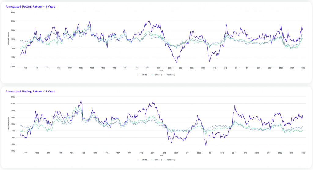
The rolling return analysis below shows how diversification reshapes outcome reliability across time horizons, not just long-term averages.
Portfolio 1 shows the widest dispersion at every horizon. While its best rolling periods are meaningfully higher, its worst rolling outcomes are severe, especially over shorter windows.
One-year and three-year rolling lows show that investors could experience deeply negative results even when long-term averages appear attractive. This creates strong path dependence, where entry timing dominates outcomes.
Portfolio 2 compresses the distribution materially. Average rolling returns are lower, but the downside improves sharply across all horizons.
This is the effect of a) bonds being different than stocks, and b) bonds having more finite duration, which constricts their volatility and hence the aggregate volatility of the portfolio.
So by five years and beyond, rolling lows turn positive, meaning investors are far less likely to experience extended losing periods.
This reduction in dispersion is often more important than maximizing peak outcomes, particularly for capital that has to remain invested continuously.
Portfolio 3 improves the profile further by tightening the lower bound and without sacrificing average returns.
At short horizons, its worst rolling outcomes are meaningfully better than both alternatives.
Over longer horizons, Portfolio 3 consistently gives you positive minimum rolling returns with narrower gaps between highs and lows. This shows better consistency in realized outcomes across market regimes. That’s also one of the central purposes is not getting the big ups and downs.
Diversification also reduces the dependence on favorable entry points and allows compounding to work more in a more predictable way.
For institutions and long-term investors, rolling return stability is often the defining characteristic of a quality portfolio.
Rolling Returns
| Roll Period | Portfolio 1 | Portfolio 2 | Portfolio 3 | ||||||
|---|---|---|---|---|---|---|---|---|---|
| Average | High | Low | Average | High | Low | Average | High | Low | |
| 1 year | 12.08% | 66.73% | -43.18% | 8.93% | 48.02% | -17.15% | 9.50% | 47.36% | -15.47% |
| 3 years | 11.31% | 30.70% | -16.27% | 8.85% | 24.63% | -2.12% | 9.15% | 22.87% | -0.37% |
| 5 years | 11.41% | 27.25% | -6.23% | 9.04% | 22.27% | 1.95% | 9.24% | 20.21% | 3.22% |
| 7 years | 11.37% | 21.23% | -3.02% | 9.16% | 18.84% | 3.72% | 9.29% | 16.08% | 4.93% |
| 10 years | 11.30% | 18.89% | -2.57% | 9.33% | 15.92% | 3.85% | 9.28% | 14.58% | 4.71% |
| 15 years | 11.07% | 18.21% | 4.25% | 9.41% | 14.66% | 5.58% | 9.27% | 13.28% | 5.95% |
Now let’s add a portfolio 4.
This time, we’re going to add a managed futures strategy to the mix at 20% of the portfolio.
Using these ETFs, we have a blended expense ratio of 0.31%, meaning we spend $31 in annual expenses for every $10,000 invested.
Portfolio 4
| Ticker | Name | Allocation |
|---|---|---|
| SPY | SPDR S&P 500 ETF | 30.00% |
| IEF | iShares 7-10 Year Treasury Bond ETF | 35.00% |
| GLD | SPDR Gold Shares | 15.00% |
| DBMF | iMGP DBi Managed Futures Strategy ETF | 20.00% |
Our performance stats are below.
Note that because managed futures are relatively new in ETF form, our statistics only go back to January 2020.
Performance Summary
| Metric | Portfolio 4 | Vanguard 500 Index Investor |
|---|---|---|
| Start Balance | $10,000 | $10,000 |
| End Balance | $17,025 | $23,021 |
| Annualized Return (CAGR) | 9.41% | 15.13% |
| Standard Deviation | 6.74% | 17.27% |
| Best Year | 19.94% | 28.53% |
| Worst Year | -6.57% | -18.23% |
| Maximum Drawdown | -7.77% | -23.95% |
| Sharpe Ratio | 0.97 | 0.75 |
| Sortino Ratio | 1.69 | 1.18 |
| Benchmark Correlation | 0.82 | 1.00 |
Adding managed futures in Portfolio 4 improves the portfolio along the dimensions that matter most for long-term capital efficiency rather than headline returns.
It also does better than our stocks-bonds-gold portfolio because managed futures tend to be uncorrelated with all three.
The most immediate improvement is risk compression. Standard deviation drops to 6.74%, less than half the volatility of an equity-only portfolio. And meaningfully lower than a traditional stock-bond-gold mix.
This limits the size and frequency of adverse compounding paths, which is why both the worst year and maximum drawdown shrink a lot.
A maximum drawdown of roughly minus-8% isn’t enough of a sample size since we aren’t putting this portfolio through the dot-com crash, October 1987, 2008, or other major hiccups.
But it does include 2022, when correlations of stocks and bonds converged.
Drawdowns like this can fundamentally change how capital behaves during stress, which can enable you to remain fully invested rather than reacting defensively.
Managed futures/CTA strategies contribute by introducing a direction-agnostic return stream.
DBMF doesn’t depend on rising equities, falling rates, or inflation protection to work. It can be long or short across stocks, bonds, commodities, and currencies.
This allows it to monetize sustained trends that typically coincide with periods when balanced portfolios struggle. This is visible in the improved downside outcomes (without having to sacrifice long-run return potential).
Risk-adjusted performance improves sharply. Despite a lower CAGR than a pure equity benchmark, Portfolio 4 delivers meaningfully higher Sharpe and Sortino ratios.
That tells us returns are being earned more efficiently and with far less downside volatility.
Importantly, this is achieved while maintaining substantial exposure to growth assets. The portfolio isn’t defensive in the traditional sense; it is diversified across independent return drivers.
Correlation to the equity benchmark falls to 0.82, so a meaningful portion of returns now comes from non-equity sources.
This diversification explains why the portfolio performs more consistently across various market environments and avoids deep drawdowns even when equities fall.
From an institutional perspective, this is where the real advantage emerges.
Because Portfolio 4 operates at much lower volatility, it can be scaled or levered to target equity-like risk while preserving its superior drawdown control and risk-adjusted returns. In other words, diversification doesn’t reduce opportunity. It increases flexibility and capital efficiency.
Risk and Return Metrics
| Metric | Portfolio 4 | Vanguard 500 Index Investor |
|---|---|---|
| Arithmetic Mean (monthly) | 0.77% | 1.30% |
| Arithmetic Mean (annualized) | 9.65% | 16.82% |
| Geometric Mean (monthly) | 0.75% | 1.18% |
| Geometric Mean (annualized) | 9.41% | 15.13% |
| Standard Deviation (monthly) | 1.94% | 4.99% |
| Standard Deviation (annualized) | 6.74% | 17.27% |
| Downside Deviation (monthly) | 1.00% | 3.08% |
| Maximum Drawdown | -7.77% | -23.95% |
| Benchmark Correlation | 0.82 | 1.00 |
| Beta(*) | 0.32 | 1.00 |
| Alpha (annualized) | 4.22% | -0.00% |
| R2 | 67.80% | 100.00% |
| Sharpe Ratio | 0.97 | 0.75 |
| Sortino Ratio | 1.69 | 1.18 |
| Treynor Ratio (%) | 20.29 | 12.92 |
| Calmar Ratio | 3.54 | 2.46 |
| Modigliani–Modigliani Measure | 19.51% | 15.65% |
| Active Return | -5.72% | N/A |
| Tracking Error | 12.33% | N/A |
| Information Ratio | -0.46 | N/A |
| Skewness | -0.15 | -0.42 |
| Excess Kurtosis | -0.77 | 0.14 |
| Historical Value-at-Risk (5%) | 2.51% | 8.25% |
| Analytical Value-at-Risk (5%) | 2.54% | 6.90% |
| Conditional Value-at-Risk (5%) | 2.65% | 9.65% |
| Upside Capture Ratio (%) | 40.48 | 100.00 |
| Downside Capture Ratio (%) | 31.27 | 100.00 |
| Safe Withdrawal Rate | 21.79% | 25.71% |
| Perpetual Withdrawal Rate | 5.93% | 11.44% |
| Positive Periods | 46 out of 71 (64.79%) | 46 out of 71 (64.79%) |
| Gain/Loss Ratio | 1.36 | 1.03 |
| * Vanguard 500 Index Investor is used as the benchmark for calculations. Value-at-risk metrics are monthly values. | ||
This deeper metric breakdown shows how Portfolio 4 changes the structure of returns rather than simply smoothing them.
Positive periods are the exact same. Each portfolio has up months around 65% of the time.
But it’s about the nature of the ups and downs.
A notable shift is visible in beta and R². With a beta of just 0.32 and R² under 70 percent, Portfolio 4 is no longer dominated by equity market movements. A substantial portion of its performance comes from sources that don’t co-move with stocks, which explains why alpha is positive even though absolute returns – unlevered – trail a strong equity benchmark.
This is genuine diversification rather than disguised equity exposure.
Tail risk metrics reinforce this point. Historical, analytical, and conditional Value at Risk are all dramatically lower, which shows that extreme monthly losses are far less likely and far less severe.
This reduction in tail exposure matters more than average volatility because it directly addresses the scenarios that cause forced selling, leverage constraints, or behavioral capitulation.
Excess kurtosis also turns negative, showing a thinner left tail and fewer extreme outcomes.
The Calmar, Treynor, and Modigliani-Modigliani measures all improve meaningfully. These metrics reward portfolios that convert risk into return efficiently – particularly when drawdowns are controlled.
After all, that’s what most institutional portfolios aim for.
Portfolio 4 excels here because it earns returns without relying heavily on market beta (copying stock market returns), allowing each unit of risk to work harder.
Capture ratios further clarify the tradeoff. Upside participation is intentionally limited, but downside capture is reduced by even more.
This asymmetry explains the higher gain loss ratio and improved skewness. Losses are smaller and more controlled, while gains remain frequent enough to support steady compounding.
It has 39% of the volatility but still two-thirds of the return.
Tracking error and information ratio appear unfavorable only because the benchmark is a pure equity index. Portfolio 4 is not designed to track equities, so deviation is expected and desirable.
Overall, these metrics show that Portfolio 4 prioritizes capital durability and efficiency more effectively than the previous three examples.
It sacrifices headline returns during equity booms in exchange for superior behavior across full cycles, especially when markets are unstable or environmental shifts occur.
Annual Returns
| Year | Inflation | Portfolio 1 | Vanguard 500 Index Investor | SPDR S&P 500 ETF (SPY) | iShares 7-10 Year Treasury Bond ETF (IEF) | SPDR Gold Shares (GLD) | iMGP DBi Managed Futures Strategy ETF (DBMF) | ||||
|---|---|---|---|---|---|---|---|---|---|---|---|
| Return | Balance | Yield | Income | Return | Balance | ||||||
| 2025 | 2.11% | 19.94% | $17,025 | 1.81% | $257 | 17.65% | $23,021 | 17.62% | 8.86% | 60.19% | 12.61% |
| 2024 | 2.89% | 12.69% | $14,195 | 2.87% | $361 | 24.84% | $19,567 | 24.89% | -0.64% | 26.66% | 7.25% |
| 2023 | 3.35% | 9.25% | $12,596 | 2.08% | $240 | 26.11% | $15,673 | 26.19% | 3.64% | 12.69% | -8.94% |
| 2022 | 6.45% | -6.57% | $11,530 | 2.72% | $336 | -18.23% | $12,428 | -18.17% | -15.16% | -0.77% | 21.53% |
| 2021 | 7.04% | 9.11% | $12,340 | 2.84% | $321 | 28.53% | $15,199 | 28.75% | -3.33% | -4.15% | 11.38% |
| 2020 | 1.36% | 13.10% | $11,310 | 1.12% | $112 | 18.25% | $11,825 | 18.37% | 10.01% | 24.81% | 1.80% |
| Annual return for 2025 is from 01/01/2025 to 11/30/2025 | |||||||||||
Drawdowns for Portfolio 1
| Rank | Start | End | Length | Recovery By | Recovery Time | Underwater Period | Drawdown |
|---|---|---|---|---|---|---|---|
| 1 | Jan 2022 | Sep 2022 | 9 months | Dec 2023 | 1 year 3 months | 2 years | -7.77% |
| 2 | Feb 2020 | Mar 2020 | 2 months | Apr 2020 | 1 month | 3 months | -3.58% |
| 3 | Sep 2020 | Oct 2020 | 2 months | Dec 2020 | 2 months | 4 months | -3.54% |
| 4 | Sep 2021 | Sep 2021 | 1 month | Oct 2021 | 1 month | 2 months | -2.56% |
| 5 | Dec 2024 | Dec 2024 | 1 month | Jan 2025 | 1 month | 2 months | -1.88% |
| 6 | Oct 2024 | Oct 2024 | 1 month | Nov 2024 | 1 month | 2 months | -1.48% |
| 7 | Jan 2021 | Feb 2021 | 2 months | Apr 2021 | 2 months | 4 months | -1.21% |
| 8 | Apr 2024 | Apr 2024 | 1 month | May 2024 | 1 month | 2 months | -0.90% |
| 9 | Nov 2021 | Nov 2021 | 1 month | Dec 2021 | 1 month | 2 months | -0.53% |
| 10 | Mar 2025 | Mar 2025 | 1 month | Apr 2025 | 1 month | 2 months | -0.34% |
| Worst 10 drawdowns included above | |||||||
Drawdowns for Vanguard 500 Index Investor
| Rank | Start | End | Length | Recovery By | Recovery Time | Underwater Period | Drawdown |
|---|---|---|---|---|---|---|---|
| 1 | Jan 2022 | Sep 2022 | 9 months | Dec 2023 | 1 year 3 months | 2 years | -23.95% |
| 2 | Jan 2020 | Mar 2020 | 3 months | Jul 2020 | 4 months | 7 months | -19.63% |
| 3 | Feb 2025 | Apr 2025 | 3 months | Jun 2025 | 2 months | 5 months | -7.53% |
| 4 | Sep 2020 | Oct 2020 | 2 months | Nov 2020 | 1 month | 3 months | -6.38% |
| 5 | Sep 2021 | Sep 2021 | 1 month | Oct 2021 | 1 month | 2 months | -4.66% |
| 6 | Apr 2024 | Apr 2024 | 1 month | May 2024 | 1 month | 2 months | -4.10% |
| 7 | Dec 2024 | Dec 2024 | 1 month | Jan 2025 | 1 month | 2 months | -2.40% |
| 8 | Jan 2021 | Jan 2021 | 1 month | Feb 2021 | 1 month | 2 months | -1.02% |
| 9 | Oct 2024 | Oct 2024 | 1 month | Nov 2024 | 1 month | 2 months | -0.92% |
| 10 | Nov 2021 | Nov 2021 | 1 month | Dec 2021 | 1 month | 2 months | -0.71% |
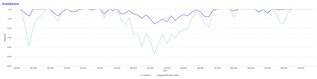
These drawdown tables show how diversification fundamentally alters the depth, duration, and recovery profile of losses, not just their frequency.
The diversified portfolio experiences its largest drawdown during the 2022 tightening cycle. But the magnitude is limited to roughly minus-8%.
More importantly, the drawdown resolves without cascading into multi-year capital impairment.
Even the worst episode recovers within a reasonable timeframe, and subsequent drawdowns are shallow, brief, and quickly repaired.
Most underwater periods last only a few months, with recovery typically occurring within one to two months after the trough.
By contrast, the equity benchmark exhibits far deeper and more persistent drawdowns. The 2022 episode reaches nearly minus-24% and remains underwater for roughly two years.
Earlier crises show a similar pattern. Losses are larger, recovery windows are longer, and capital remains impaired for extended periods.
These prolonged underwater stretches are where long-term plans often break down, whether due to behavioral pressure, liquidity needs, or institutional risk constraints.
The difference isn’t simply severity but path dependence. In the diversified portfolio, drawdowns are discrete events.
In the equity-only portfolio, drawdowns compound into regimes. Large losses increase the probability of further losses, delay recovery, and amplify volatility drag.
That is why the equity benchmark repeatedly shows longer underwater periods even when recovery eventually occurs.
Another key distinction is drawdown ranking consistency.
In the diversified portfolio, drawdowns cluster tightly around small magnitudes.
In the equity portfolio, the distribution is wide, with a few extreme events dominating the experience. This skew creates unknowns around planning assumptions such as rebalancing, spending, or leverage.
From a portfolio construction standpoint, we know that limiting drawdown depth:
- shortens recovery time
- preserves optionality, and
- allows capital to compound in a more continuous rather than episodic manner
That is the practical value of diversification.
Portfolio Assets
| Ticker | Name | CAGR | Stdev | Best Year | Worst Year | Max Drawdown | Sharpe Ratio | Sortino Ratio |
|---|---|---|---|---|---|---|---|---|
| SPY | SPDR S&P 500 ETF | 15.21% | 17.24% | 28.75% | -18.17% | -23.93% | 0.75 | 1.18 |
| IEF | iShares 7-10 Year Treasury Bond ETF | 0.19% | 7.45% | 10.01% | -15.16% | -23.15% | -0.31 | -0.40 |
| GLD | SPDR Gold Shares | 18.38% | 14.85% | 60.19% | -4.15% | -18.08% | 1.04 | 2.13 |
| DBMF | iMGP DBi Managed Futures Strategy ETF | 7.28% | 11.35% | 21.53% | -8.94% | -17.35% | 0.43 | 0.67 |
Monthly Correlations
| Ticker | Name | SPY | IEF | GLD | DBMF | Portfolio 1 | Vanguard 500 Index Investor |
|---|---|---|---|---|---|---|---|
| SPY | SPDR S&P 500 ETF | 1.00 | 0.31 | 0.18 | -0.18 | 0.82 | 1.00 |
| IEF | iShares 7-10 Year Treasury Bond ETF | 0.31 | 1.00 | 0.37 | -0.55 | 0.53 | 0.31 |
| GLD | SPDR Gold Shares | 0.18 | 0.37 | 1.00 | -0.08 | 0.58 | 0.18 |
| DBMF | iMGP DBi Managed Futures Strategy ETF | -0.18 | -0.55 | -0.08 | 1.00 | 0.01 | -0.18 |
The correlation matrix shows why Portfolio 4 behaves fundamentally differently from a traditional equity benchmark.
Equities, bonds, and gold all exhibit positive correlations with one another to varying degrees, meaning they still tend to respond to overlapping macro forces such as growth expectations, inflation, and monetary policy. Even when correlations are modest, they are rarely negative at the same time, which limits diversification during regime shifts.
Managed futures stand apart.
DBMF shows negative correlation to both equities and Treasuries and near-zero correlation to gold.
As explained, this has to do with its ability to profit from sustained trends regardless of direction rather than relying on a specific macro outcome. As a result, it acts as a better stabilizer than a conditional hedge.
When combined at the portfolio level, these relationships materially reduce aggregate correlation to the equity benchmark. This explains the improvements seen in drawdowns, tail risk, and risk-adjusted metrics throughout the analysis.
The key takeaway is structural.
Diversification here isn’t achieved by owning more assets, but by combining return streams that react differently.
And because of this, it gives more leeway to lever if wanted, as the structure can handle it.
Rolling Returns
| Roll Period | Portfolio 1 | Vanguard 500 Index Investor | ||||
|---|---|---|---|---|---|---|
| Average | High | Low | Average | High | Low | |
| 1 year | 8.02% | 21.35% | -6.57% | 17.18% | 56.19% | -18.23% |
| 3 years | 6.11% | 13.29% | 3.00% | 12.67% | 24.76% | 7.51% |
| 5 years | 7.81% | 9.29% | 6.89% | 15.95% | 18.43% | 14.37% |
The rolling return comparison shows the tradeoff between upside variability and outcome reliability.
The equity benchmark shows a very wide dispersion of outcomes, especially over shorter horizons. It’s concentrated and has a lot of duration.
One-year rolling returns range from large gains to deep losses, meaning your experience is highly dependent on entry point.
While average returns are strong, the low end of the distribution includes periods of capital loss. This increases timing risk and behavioral stress.
By contrast, the diversified portfolio produces a much tighter return range. Upside is intentionally capped relative to equities, but downside outcomes are substantially improved. Leverage or leverage-like techniques help improve the returns relative to equities while keeping risk in check.
Even at the one-year horizon, losses are smaller and less frequent, while multi-year rolling periods remain consistently positive. This reduces the probability of extended negative experiences and allows capital to compound in a more predictable way.
Over longer horizons, the gap in average returns narrows while the stability advantage persists. The diversified portfolio sacrifices upside in exchange for far better consistency. Outcomes are less sensitive to market cycles.
For those focused on durability rather than maximizing peak returns, this distributional improvement is often a great advantage to have.
Putting Negative Correlation Strategies into Practice
Portfolio Construction Considerations
Integrating negatively correlated assets requires careful planning.
The proportion allocated to these strategies depends on an trader’s risk tolerance and goals.
Too little, and the diversification benefit may be minimal.
Too much, and it could drag on overall returns during bull markets.
Fundamentally, it’s an optimization problem.
Regular rebalancing is also important to maintain the desired allocation as market movements alter the portfolio’s composition.
Risk Management Imperatives
While negative correlation strategies can reduce overall portfolio risk, they often come with their own unique risks.
Leverage, counterparty risk, and liquidity risk are common concerns.
It’s essential to thoroughly understand each strategy’s risk profile.
Implementing stop-loss orders, position sizing rules, and diversification within the negative correlation portion of the portfolio can help manage these risks.
Cost Analysis
Many negative correlation strategies involve higher costs than traditional buy-and-hold investing.
These can include higher expense ratios for specialized ETFs, trading commissions, and the cost of rolling futures contracts.
The potential benefits must be weighed against these costs.
In some cases, the protection offered during market downturns can justify higher expenses, but this isn’t universally true.
Timing and Market Conditions
The effectiveness of negative correlation strategies can vary depending on market conditions.
What works well in a crisis may underperform during calm periods.
Some strategies, like tail risk hedging, are specifically designed for extreme events.
Others, like managed futures, can adapt to different market environments.
Understanding how each strategy is likely to perform in various scenarios is important for understanding how to structure them in a portfolio.
Challenges & Limits to Negative Correlation Strategies
Correlation Breakdown
One of the biggest challenges with negative correlation strategies is that correlations can break down when they’re needed most.
During extreme market stress, many assets may move in the same direction as investors rush to liquidate positions because they need cash.
This phenomenon is known as correlation convergence, and can negate the diversification benefits of these strategies.
When you look at correlations you’re ultimately getting averages that vary over time.
No strategy offers perfect protection.
Cross Correlations
Once you get to a certain number of return streams, cross correlations start factoring in, which limits the diversification value.
Complexity and Expertise Required
Many negative correlation strategies are complex and require specialized knowledge to implement effectively.
This complexity can lead to mistakes if not properly understood.
It also means that these strategies may not be suitable for all traders/investors.
Professional guidance is often necessary, which can add to the overall cost of implementation.
Opportunity Cost
While negative correlation strategies can provide protection, they can also limit upside potential during strong bull markets.
This opportunity cost needs to be carefully considered.
An overly defensive portfolio may underperform during extended periods of market growth.
Balancing protection with growth potential is a key challenge in portfolio construction.
Regulatory and Tax Considerations
Some negative correlation strategies may have unfavorable tax treatment or be subject to changing regulations.
For example, short selling and certain derivative strategies can have complex tax implications.
Regulatory changes can also impact the viability of certain strategies.
Future-Proofing Negative Correlation Strategies
Evolving Markets
As markets evolve, so do the relationships between different assets.
Traditional correlations may shift over time.
For example, the negative correlation between stocks and bonds showed a lot of weakness in a market environment like 2022.
This shows how this period can be even worse than a period like 2008.
This evolution necessitates ongoing research and adaptation of negative correlation strategies.
Technological Advancements
Machine learning and artificial intelligence are increasingly being applied to identify and exploit complex correlations in financial markets.
These technologies may lead to more sophisticated negative correlation strategies in the future.
They could potentially uncover relationships that human analysts might miss. That can in turn open up new opportunities for portfolio diversification.
Doing this is, of course, a skill-based thing.
Conclusion
Negative correlation strategies offer ways for better portfolio diversification and risk management.
They can provide protection during market downturns and help smooth out returns over time.
However, they’re not without challenges. Implementing these strategies effectively requires careful consideration of costs, risks, and individual goals.
Ultimately, the most successful use of negative correlation strategies comes from a deep understanding of their mechanics, a clear-eyed assessment of their limitations, and a willingness to adjust when necessary.