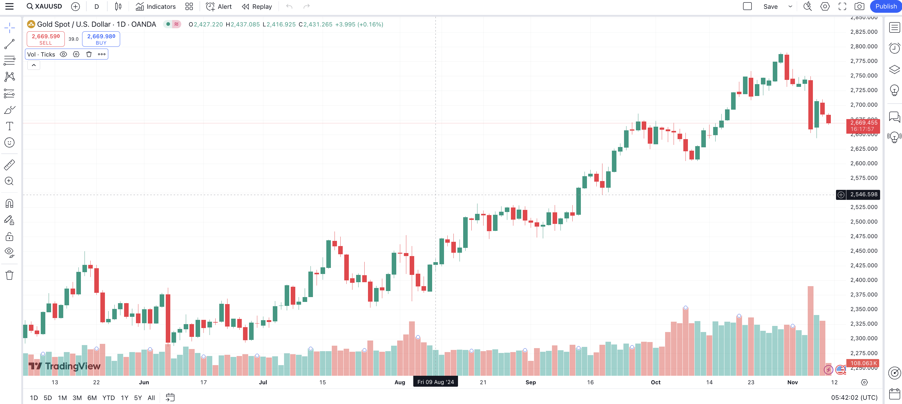
So, your chart shows gold’s daily price movements over several months. Here are the basics:
Each bar or “candlestick” on this chart shows the price range within a day (you’ve got the TF set to “D” in the top left).
Green candlesticks represent days when the closing price was higher than the opening price, signaling an upward movement.
Red candlesticks represent days when the closing price was lower than the opening price, signaling a downward movement.
Each candlestick has four main values:
Open: The starting price for that day.
Close: The ending price for that day.
High: The highest price reached during the day.
Low: The lowest price reached during the day.
When the chart shows consecutive green candlesticks, especially with higher highs and higher lows, it’s known as an uptrend.
When the chart has consecutive red candlesticks, often with lower highs and lower lows, it’s known as a downtrend.
Below the price chart are colored bars representing trading volume for each day.
Volume shows the number of transactions that happened on each day, providing insights into the amount of market activity.
Green volume bars indicate higher buying volume, while red bars indicate higher selling volume.
Reply
